Portfolio


One major challenge has been how I present this work as a portfolio. A lot of the work has been created with a digital presence, yet at the same time there are these over laps into the offline world. Google Image Still Life has been the main project I have been working on over the course of the unit but along the way I have created separate series that link in to my ongoing investigation of arts transition into online spaces. The two most refined and considered of these projects other than Google Image Still life, are The Rothko Room and An Arrival of a Train at La Ciotat. In the gallery Google Image Still Life exists on digital displays that have the potential to vanish as quick as they appear. But for the portfolio I require something a lot more permanent. The Rothko Room series has become an online Instagram profile and the images manifest on this social platform, again something needs to translate into a portfolio. With An Arrival of a Train at La Ciotat we already have this physical object of the book and its already defined it place in the offline world but this would still need to be worked into the portfolio. 

Because there were so many conjunctions and cross overs between the platforms of which this work can be experienced I decided to create two portfolios. The primary portfolio would exists on the web, I’d create a professional looking page that would comfortably supported each of these series. The secondary portfolio would be a small box of prints as well as the book that defined the work in an offline context. This portfolio could be easily transported to galleries and interviews and although would be finished to a high standard it would act as a compliment to the online portfolio. 

I decided to build this portfolio on my existing website. It has become a separate page from the main site as I didn't want to conflict with other projects from other units that were not part of this submission. On the website I could clearly define each of these three projects with the use of different pages and galleries. I have kept the presentation as simple as possible in order to recreate the clean professional nature of a traditional portfolio box. 


Clicking on the first page revels my Google Image Still Life series. Here we have a selection of 10 images. The first four are the four images that will be displayed in the vertical gallery space and are the images that I feel are the most impactful. I have arranged these images on the overview to flow as nicely as possible by breaking apart the matched colours. This diagonal grouping of colour precedes throughout the section of the 10 images. The next four are the images that are going to go on display in the Holden Gallery. Lastly there are two images that I feel work really well as digital collages. I love the presence of them but the are not quite as refined to make the gallery. Instead they've been included in the portfolio. By clicking on any of these images we can see them as they are intended, filling the screen and allowing the audience to get lost in their unfamiliarity. Clicking on the image also releases the work from the constraint of the crop that had to be used to create a uniform design on the overview. Having these images online allows them to exist where I believe they truly flourish, as a twisted form of digital painting. It is the pixel that makes up the image, instead of ink and the depth of the illuminated digital image is produced. 


The Rothko Room exists as an Instagram profile. I have re-uploaded the images that were ripped from the site in their new appearance with everything but the painting removed. The first thing we see on this page is a direct link to that Instagram page where the work can be seen in its true context. I have also included a grid of these images that we are able to scroll through replicating the feel of Instagram on my own page. The grouping of these images works really well. We can feel the presences and repetition of the images in this grid. With the white background of the website these images remain floating in the middle of the page as the background becomes transparent. There is nothing but the Rothko painting to distract the eye. 


I didn't want to leave the An Arrival of a Train at La Ciotat out of this online portfolio so I have created a version of the work as an ebook and published it through a website called issuu. This creates a html app that can be embedded into my own site. Here we can encounter a page turner copy of this book. I felt that maintaining the presence of the work as a book was important to enforce the reframing of this text in its transition from youtube comment to printed word. By repositioning this work as simple text on the webpage wouldn’t help support my appropriation of the work. 


The physical version of this portfolio was based around the structure of its online counterpart. Holding these three distinct projects. I didn't want this version to distract to much from the website and elected to create this portfolio on a smaller scale that I would normally use. I felt that an a5 portfolio would suit the work well, and would also fit the book perfectly. This compact version could support the work on the website and act as a reference when viewing the work in its digital form. That said I still wanted this small portfolio look professional. It would become something that I could take with me to show curators artists and anyone else with an interest in my practice. 


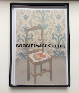
This would be presented in a traditional black portfolio box at size a5. I would print all the images on 300gsm paper at a5 size, these images are really nice to handle and move around the table in order to view them, but work just as well viewed inside the box. The Google Image Still Life series would be printed with a single image on each sheet of a5, where as I wanted to keep the grid of images for The Rothko Room.  I felt that this firstly reflected where and how the images were truly represented as well as showing the breadth and repetition of this work and of course wouldn’t want to do this by printing one image per page. I have used title pages printed on tracing paper that doesn’t distract the flow of the work to much but still works really nice in the box. Because of its smaller size, rotating the box to view different orientations wasn’t that much effort. But in the sequencing of the images I  still was wary of the viewer having to rotate to much. The first image and title pages are portrait, then we see the body of the google images still life series landscape, the last image in this series is portrait again and leads us into the next projects and title pages that are all portrait. 

It was fairly self evident at how he book was would exist in the portfolio box. Lucky enough I had printed the book at the same proportions to perfectly fit with the box. Like the website this was the last thing we encounter in the box. This is not a book that you read cover to cover, but it can easily be picked up and enjoyed at any page.  I feel that the humorous elements really round of the experience of my portfolio well. It truly defines the content of the internet. Finishing with ‘the comments section' brings the work to a conclusion perfectly. 


I think that with the two portfolios you get a great impression of the body of work that I have been creating and an experience of my practice and the directions that I am heading. It would have been really great to get some images of my work installed in the gallery to put into the portfolio. But as soon as I have these available they will be placed in so that any onlooker can gauge how this work can truly translate into the offline space. 

Holden Gallery - iPad Plinth Construction

After creating various plans in sketch up about how to secure the iPads in place in the plinth I finally came up with a suitable solution. At first I was questioning how the security kit could be used but not disrupt the edges of the image. In this case I decided not to use the kit and to create my own secure frame using wood that could be screwed and unscrewed if anything went wrong with the iPads. Each side of the cube would be made of three parts. A backboard that kept the iPad upright as well as providing a hole for the charger. A frame that housed the iPad to make sure that it was in position. And finally a frame with a hole that fitted the image shown on the screen and stopped the iPad falling out the other side. This last frame would be the only visible element. The back board and the iPad frame would be glued and pinned together, and once the iPad had been placed inside, had the charger attached and the image running on the screen then this front panel would be screwed on to the other elements in order to conceal everything but the frame and the image. 


Hidden Elements - Backboard and iPad Frame


Visible Front Panel

All the three elements for each side were cut on the CNC machine using plans that had been drawn in CAD software. This allowed me to be incredibly accurate and keep each side of the cube uniform. In my CAD plans I had to account for an over lapping edge on each side in ordered for this to remain a cube. The first two hidden elements were cut on 12mm MDF, this width could comfortably house the width of the iPad but also mean that there was an offset of 24mm on each side. The side of each panel when assembled as a cube is 330mm2 but in order to achieve this the two pieces of wood had to be cut to a width of 300mm in order to account for the 24mm on the overlap. The front panel was cut on 6mm plywood and had to then be cut to a with a width of 324mm and height of 330mm, the final 6mm would be added on as the wood overlapped on the other side. I had original cut the front panel on MDF but after creating a test cut it didn't really have the finish that I wanted. With the Plywood there is a much nicer feel to the wood and it created much more professional finish. The housing with out the front frames have then been bracketed together as well as 4 brackets on the base in order to attach it to the plinth. 

Once these iPads were secured into the frames then it would become very complicated to take them out again. The devices would be constantly charged and the frames were fitted with holes for the iPads to reach the chargers. The only contact that you would have with the devices would be through the screens. I didn't want the images to be disrupted in any way, by fingers that might touch the screen, therefore I used a function on the iPad that disables all interaction unless the home button was press three times. Since the home button was hidden behind the from panel the images being displayed could not vanish. Once this screen was locked the I would also disable the automatic locking and sleep mode in order to keep the image on the screen. Basically once those final screws were placed in the frames and there was constant power running through to the chargers then the images shouldn't disappear. In this sense it made the iPads a very practical means of displaying images. 

Since the construction of this housing i could assemble the iPads behind this front panel and the images look really amazing. The retina display of the iPad really does the work justice, and the illuminated appearance of the image bursting from this wooden case looks really intriguing. I had jubilations that the images might appear quite flat or dull in the frames, but once in place it gives real depth to the work. You can peer inside the frame and are greeted by an image that is full of crisp colour, made from objects that come alive within the screen of the iPad. 


It has been a lot of effort to exhibit this work digitally, there have been many challenges that have made the idea of printing and the framing the image feel very desirable but bringing this cube together has really paid off. I felt that following my commitment to showing this work digitally has been very successful, the images that have been made possible by digital technologies and databases aren now being illuminated into the room on devices where they can truly flourish as digital paintings. I cant wait to properly instal it in the space and be able to delve into the image as the cube sits effortlessly in the middle of the room. 


Holden Gallery - Re-Proposal


After reconsidering my proposal for the vertical gallery space, I felt that using projectors to create these images was going to land up being too confusing. There was so much that could go wrong and especially for an exhibition that was to run for 12 days, I needed to rethink both of my approaches. With the vertical gallery I had abandoned the idea of the cube totally. I understood that to maximise the potential of the spaces that were available mounting the images on the walls was the best solution. Yet, I felt that recreating this cube on top of a plinth could do something really interesting. On the one hand we had these images adhering to the gallery’s context of paintings on the wall, but in the more traditional gallery it was pushing the image away from the wall into the centre of the room. Here with this added dimension the context for the image is a lot different. We are peering into a box and confronted with these disconcerting, almost crude images. I think that in this setting the images will be much harder to decipher and there will be more uncertainty to them. They have traveled from sitting comfortably on the wall to be stranded in the middle of the room, sitting on this plinth as if they were an object. I feel that the size constraints that I've given my self are forcing this work away from the wall. The walls in the Holden Gallery are huge and will be filled with a lot of large scale work. My exploration of the space in the centre of the room allows the images to flourish on their own. 


I had an initial idea that this work would be fitted on two plinths with two cubes and images on two sides of each cube. But from drawing the plans in sketch up it didn't really work very well. There didn't seem to be a need for the work to be spread like this. I think that one cube with an image on each vertical side would feel a lot more concise and give the work this central grounding instead of unnecessarily spreading it over two plinths.


 I had to find an alternative to creating an image with out the projectors. I could do this by using the same techniques used for the lager TV frames but with smaller TVs but what felt like a better option was to use iPads. An iPad is much more light weight and can display an image with out the need of any additional equipment. A hole would be cut on each side of the box at the correct proportions of each image in order to disguise the iPad. This front panel will be cut on the CNC Machine just like the frames for the larger TV’s. I had originally wanted these to be cut on the laser cutting machines in order to give the work a sharper edge but unfortunately these had been fully booked until past the time of the exhibition. The iPad will then somehow be suspended behind this first panel in a security kit and a lit will be placed on top. there will be various ways to chose this but I think I need to create a proper plan to find the most pragmatic solution.  

Vertical Gallery and Salon Hang


There are hundreds of combinations and ways that this work could potentially be hung. I have this wall that is 3m wide by 6m tall and this gives quite a lot of room to play around with. The TV’s have already been selected and therefore these sizes are also set. To plan how this will all fit on the wall I have had to measure the size of the images as they will appear on the screen. With these measurement I've been able to calculate how big these frames will be. I wanted to keep the boarders of these frames and equal distance across all of the screens I was working with. measuring how long the largest distance from the edge of the image and the edge of the tv gave me the set size of the boarder for all the frames. Once I had all of these measurement I could begin loading them into Google Sketch-Up and start planning accurately, how this would look on the wall. In Sketch Up I have been creating various plans to submit to the gallery team. I’ve found it incredibly useful to have this tool that allows me to try hundreds of options with out having to commit to any thing permanent or having to carry on drawing out plans. 


The images that I have selected have somewhat dictated how I am places these frames on the wall. I’ve selected four of the images of the strongest images that I’ve created and the images that I feel will work best on a large scale. These are images that really challenge the idea of the painting and the photograph. They are the images that will fool you the most especially on this larger scale. Two of the images were selected for the interim show so I knew how they would work in an exhibition space as well as two other images that really came together when making the work. I think that this illusion is mainly created by finding images that were all shot at relatively similar angles and perspectives. This all comes together to create a believable image that is filled with uncertainty. I love the idea of seeing these images at a glance before getting closer and closer and feeling them fall apart. 


I had one 60”, two 47” and one 42” sized screens. This larger screen is a lot larger by quite some distance. Working out what image would go on this screen became a challenge. The space was just the right size for this section of screens but I quickly realised that with the 60” in a landscape orientation it would have taken up a huge amount of space. Luckily the wall that I have been assign is 6m tall and gave me a lot of room to work with. Conveniently enough one of my images were portrait orientated and it made sense to put this image on the larger screen and attach the screen at a 90 degree angle. I decided to place the most delicate image that had the more of an intricate feel on the smallest screen. I felt that this image needed to be experiences at the closest distance. The way that my image had been constructed mean that there were some really interesting contrasts of texture and interlocked shades and shadows. By coming up close to the screen i’d hope that all of these would be revealed. And of course the two other images could both a happily fit on the medium size TV’s 

I am quite constrained by the sizes of TVs. The images I've selected are made up of two that are predominately blue and two that are predominately full of oranges and yellow. After experimenting with placements on sketch up I felt that it was best to split these images at at diagonal. This felt the most comforting to the eye, and in breaking up the images it reenforced the feel of the salon hang. I wanted the screens to be placed as if they weren't attached to any grid at all, in actual fact creating this was a lot harder than it sounded. The sizes and shapes of the tv frames meant that they were constantly overlapping or matching at certain intersections. I found various solutions but felt concerned about the heights at which these images will be shown. From top to bottom these screens would be nearly 3 meters tall. Parts of these images would either have to be very high or very low.  I think that this isn't really something that I can truly work out until I am actually hanging the work. But if I have all the other distances of the the hang then I don't think that this will be too complicated when it comes to the install. 

I feel really pleased with the plans I have so far and cant wait to get in to the gallery to carry out the install. Unfortunately this is going to be past the deadline for my FMP hand in so therefore I wont be able to submit images of the installation. But I feel that these careful plans show what I am trying to achieve. There has been a lot of stuff to sort out in regards to clearing plans with various gallery staff and technicians. Ive been having to work with three different departments of Tech + (AV Store, Wood Work and Gallery Team|) to arrange this installation and its been quite testing at times but I feel that I've approached it at a very grounded confident level. These things always take longer that you'd imagine, one thing that has really pushed the time scale back was not having access to the TV’s and being able to take measurement for the TVs until the last week of FMP. This doesn't matter to much as my deadline for installation and hanging is a couple weeks past this date but I still would have liked to include the final results in this journal. Although, this has freed up my time and allowed me to concentrate more on my Holden gallery proposals and my portfolio. 


Re-proposal for Vertical Gallery


Using foam board to act as a faux frame.


My application proposal for the vertical gallery has been successful but the panel had queried wether the work warranted the constriction of the cube and felt a little worried about the heat that could of been trapped in the box. There fore I have taken some time to reconsider how I am displaying my work. The vital factor of this work was to mimic painting. There were underlying factors of course but I felt that my presentation should try to replicate the painting as best it could. After discussions with the gallery team I realised that it would be perfectly possible to build frames around televisions. The wood would also block out the black bars of the image and present a frame around my my digital image. Although there would be complexities with building the frames this felt a lot less complicated that my previous proposal. The way that the image would sit on the wall, illuminated and full of colour, would hopefully start to match the presence of painting.


There were various TV sizes available to me in the AV store and I decided to take advantage of this the best I could. In an effort to emphasise painting and they way it is hung on the wall, I decided to arrange my images using a salon hang. This will have to be created with 4 screens and will make it a little challenging to give it that free feel of a salon, there will be no centre image and there fore it will be hard to base the images around this but by placing images out of conjunction with on another it should come together. I had hoped that this would break up the rigidness of using the screens which can feel very hard edged and quite cold. Hopefully with the frames around as well the images created could really come to life. 

These frames will be boxed so that none of the TV is visible, instead we will see the image as if it is glowing from a light box. On closer inspection this will reveal the pixels that make up the image. Filling large wall on large TV’s will hopefully create this really impactful image. The strong colour and content of the collages already creates a powerful image, but displaying it at this scale I hope will really challenge the audiences expectations. 

One element that I will have to abandon with this approach will be recreating the sizes of these paintings. I feel that matching the painting sizes with on the TVs becomes very complex. This would mean cropping large sections of certain screens and result in much poorer image qualities. With the projectors it was much easier to cut the frames to the correct size then add the projection image after but with the Tv this would not be possible. Despite this it gives me the chance to really push the size and scale of these images to fit the space. 


Holden Gallery Proposal


Finding out that we will be in the Holden Gallery is really exciting. But it is also quite a daunting prospect. Its such a great place to display art and I feel like I need to present work really well in order to do it justice. On one hand I already have my proposal to the Vertical Gallery and hope that this is successful. If it is not then feel that I will try to replicate something similar in the holden space. It is a huge space and I do feel that I can be ambitious in how the work is displayed but have to bear in mind that I am already filling one large space.   

In the circumstance that my vertical gallery proposal is accepted, then I want to create the same idea of the work just on a much smaller scale. I like the idea that in one space this work would be huge almost filling all the available space give and in a separate location work from the same series is show but on a smaller scale. This would involve installing a cube on the top of a large plinth. 

This cube would seek to match the same qualities as its larger counterpart but at a much smaller scale. Elevate on a plinth would enforce some of these sculptural elements that were being generated through this added dimension. I still wanted to challenge our expectations of seeing these images on a wall. With the Holden gallery we have plenty of space in the middle of the room to allow for movement around the work. I like the idea that each side cannot be view at once. It forces the audience around the cube as they confront the work on various multi faceted levels of context and now physical surface. I will select four alternate images to the work being shown in the vertical gallery. As the work is a lot smaller I will chose images that I feel will benefit from being show on a smaller scale. These are the paints that are much more delicate and can afford to be seen up close. 

This smaller cube will house, four mini projectors in order to create the image. The same polythene material will be used to cast the rear projections. The cube will be roughly 50cm cubed in order to cast a large enough image. Creating this cube on a smaller scale, the heat from the projectors may be a big problem. I cant really leave the top of the cube off in this case as it would be incredibility easy to just stick a hand in an ruin the image. In this case I will plan to cut holes in the top panel in order to allow heat to escape but not permit anyone to touch the equipment inside. I am open to various ideas at this stage but as we get closer to having to commit to AV bookings i feel that it is important to have one plan in place at least. 


Matisse and The Vocabulary of Objects.


 Louis Aragon, writer and close acquaintance of Matisse, compared Matisse’s collection of objects to a vocabulary - he felt that, like how a poet needs words to nourish his art, so too are these objects necessary inspirational props for Matisse. 

Stories from the Studio
Flavia Frigeri


I find this incredibly interesting on a number of levels. It is clearly true that the aesthetic value of the objects that matisse was painting had a huge effect on the impact of his art. It is his point of reference that he builds upon, layers and layers of expression added through the application of paint. I had said before that the post impressionist still life painters were creating beauty from objects that were relatively mundane. I feel that the more I look at this work the more carefully considered it becomes. Yes these objects do have a qualities of being quite prosaic, after all they are objects found in the home but looking closer you can see the carful positioning and composition. Besides from the fruit which has a different sense of beauty, the rest of the objects are filled with strong characteristics that help define the work of Matisse. They do have a perceived uniqueness which I feel makes my own collages all that more strong. These are supposed to be Matisse’s household objects, that you would imagine as being one of a kind, but the realities that the internet has opened up the world of imagery and allow me to go in and find theses resemblance’s.

The relationship between the Matisse and his objects and me and my objects are profoundly different. He has this tangible, physical relationship that allowed him to move and positioning objects that you would imagine he'd interact with everyday. My relationship with the internet objects also allows me to move the objects and replicate the positioning but my interaction is wholeheartedly different. I am seeing these objects for flat images on a screen, my only real control is the image that I select and how it is manipulated in photoshop. The rest is already a set image that has been captured into data and has a distant existence that can be exhumed with a correct search term or web address or alternately uncovered by an exploration of through a set of links. 

The vocabulary of Matisse allows his objects to transition from painting to painting, they reappear as a reoccurring motifs and become a part of a the language of the work and Matisse’s life. They even form the language of the titles of paintings. The pattern’s in the fabrics, the decoration on the sides of jugs and plates, the textures of the surfaces in his studio are the foundations of these paintings. This intern began the formation of matisse’s later work, and possible the inspiration for his cut outs. The representation in the painting is transformed through direct application of colour, broad brush marks form a new surface of the painting that moulds the objects into exquisite beauty. 


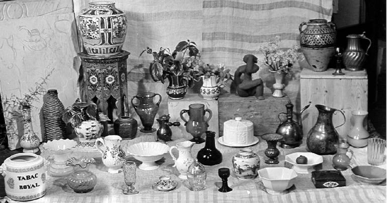
Hélène Adant, who worked as an assistant in Matisse’s suitdio at Villa le Rêve, also shared a fascination with the objects that Matisse was painting. She began photographing the set up of the still life’s and created these fascinating images. They revel a layer behind the painting, these photographs completely remove the expression that Matisse had been adding, and instead show an image that is purely representational. This peak behind that curtain is very exciting for me, it is the image that i am trying to recreate through appropriation of other images. Despite this i find that these photographs are purely documentation and although they hold so much history within them they can never reach the elevate beauty that Matisse could reach with his brush. 


I think that a vocabulary becomes very important in terms of the way we use imagery. Our language and communication has changed dramatically due to the internet. We can now repurpose images in order to express feeling or explain and support our textual communication nearly as quick as we can express them orally.  The infiltration of technology is impacting our language on multiple levels. But just like Matisse's objects became his vocabulary, the images of the web are now ours. In Jodi Dean's essay 'images without viewers' she discusses the transition of language. She outlines five key areas of oral communication that become true to digital communication too. 


  1. Ideas are combined via addition – and, and, and – rather than in a more qualifying, supporting, or hierarchizing fashion (“although,” “under certain conditions”);
  2. Repetition is frequent;
  3. Connection with actual experience, a shared lifeworld, is more compelling than analytical connection to an abstract field;
  4. Ideas express empathy and identification or their lack;
  5. Ideas are positioned as poles within a field of oppositions (for or against).
There are areas of this that are highlighted in my collages as well. The images that I've created take elements from multiple photographs that all have opposing contexts and purposes. Each object has been repurpose to fit my own desires and to match the paintings of Matisse's vocabulary. The are images and objects that have a familiarity with our own experience. A lemon or a table top is not a unfamiliar item but as all these elements are brought together they become saturated into this structure that creates a tangible outreach in an atmosphere of uncertainty. On their own these images are entirely different. They have alternate realities but the image has repeated from the image that Matisse saw in front of him, to the image that he painted, to the image that was uploaded online from which i am basing my collage, to the image that i have sourced in relation to resemble one one of Matisse's objects, to the appropriated image that exists in my work. 


New Work 

I would also like to introduce two new collages that I have been created.  I feel that making more and more of these collages I am getting a lot more used to how they need to be constructed. Here we have two images that could appear very lifelike but deeper glance into the image reveals all these impurities. I feel that i am really starting to work well with the fabrics that were so important to Matisse's work. These are the hardest parts of the collages to find, and I have had to delve into some very heavy photo manipulation  to create the flowing effect of the fabric that we can see in this last image. 

I think that the way that all of these images have been formed are incredibly interesting, there are great amounts of difference to them. In their individual strive to to replicate an image that has become before produces to really different contrasts.  This has all been dependant on the images that I can source and the qualities that these images are constructed from. I think that taking photographs from all of these separate locations starts to even out the overall aesthetic of the image. Overall we are experiencing something incredibly multifaceted and constructed through a homage to a painting that its self was created nearly a century prior.